



Fast Self-Service for Facebook Users.
24/7 online service available to all customers.
To avoid waiting time online, you could submit a ticket to us, our agent will respond within 1 business day.


Fast Self-Service for Facebook Users.
24/7 online service available to all customers.
To avoid waiting time online, you could submit a ticket to us, our agent will respond within 1 business day.
Sign In / Register
My Balance
Modlily Club
Sign in for the best experience
Processing
Please enter a valid number
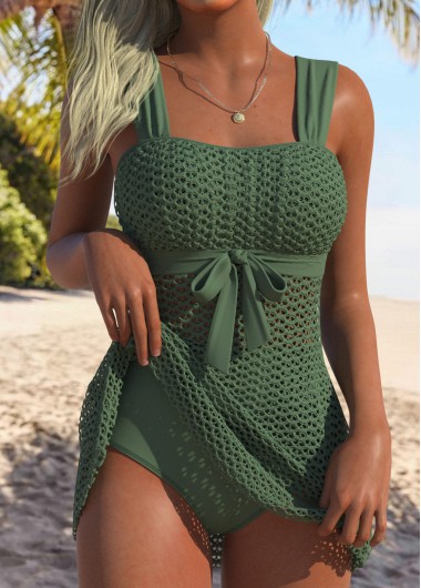

Very nice swimsuit. Nicely made.
 MODLILY CLUB
% Off
MODLILY CLUB
% Off
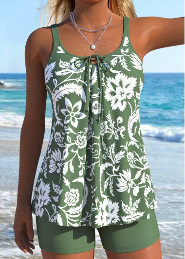
Very nice and flattering.
MODLILY CLUB
% Off
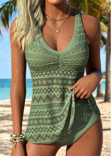
Love this color and suit. Fits true to size. Very flattering.
MODLILY CLUB
% Off
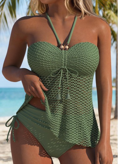
Absolutely love this! Beautiful! Got lots of compliments when wearing it.
MODLILY CLUB
% Off
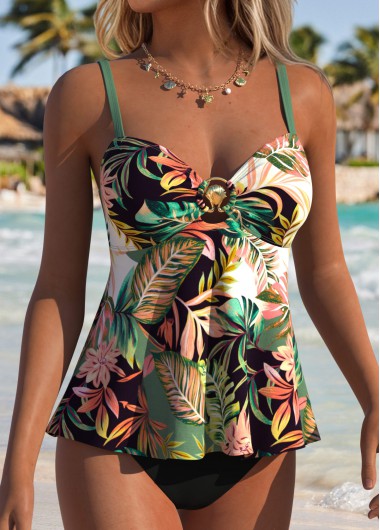
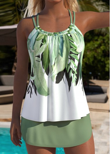
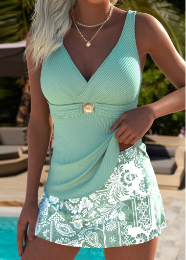
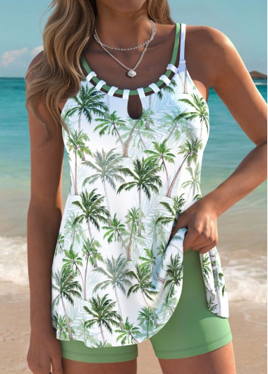
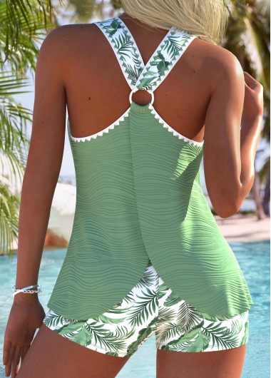
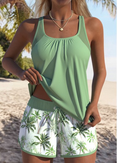
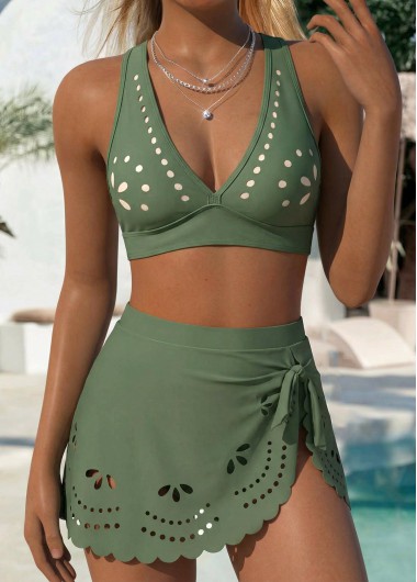
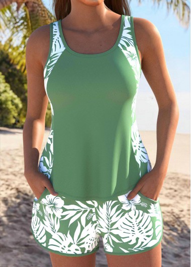
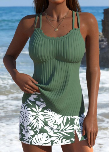
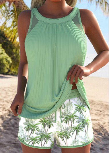
Sage Green Cut Out Tropical Plants Print Tankini Set
MODLILY CLUB % Off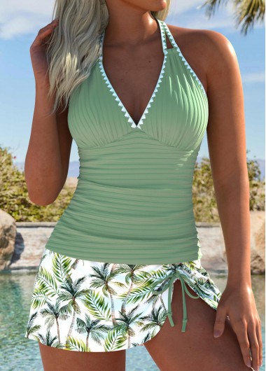 MODLILY CLUB
% Off
MODLILY CLUB
% Off
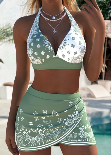 MODLILY CLUB
% Off
MODLILY CLUB
% Off
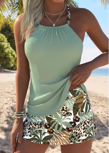 MODLILY CLUB
% Off
MODLILY CLUB
% Off
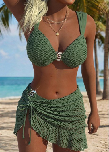 MODLILY CLUB
% Off
MODLILY CLUB
% Off
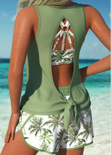 MODLILY CLUB
% Off
MODLILY CLUB
% Off
 MODLILY CLUB
% Off
MODLILY CLUB
% Off
 MODLILY CLUB
% Off
MODLILY CLUB
% Off
 MODLILY CLUB
% Off
MODLILY CLUB
% Off
 MODLILY CLUB
% Off
MODLILY CLUB
% Off
 MODLILY CLUB
% Off
MODLILY CLUB
% Off
 MODLILY CLUB
% Off
MODLILY CLUB
% Off
 MODLILY CLUB
% Off
MODLILY CLUB
% Off
 MODLILY CLUB
% Off
MODLILY CLUB
% Off
 MODLILY CLUB
% Off
MODLILY CLUB
% Off
 MODLILY CLUB
% Off
MODLILY CLUB
% Off
 MODLILY CLUB
% Off
MODLILY CLUB
% Off
 MODLILY CLUB
% Off
MODLILY CLUB
% Off
 MODLILY CLUB
% Off
MODLILY CLUB
% Off
 MODLILY CLUB
% Off
MODLILY CLUB
% Off
 MODLILY CLUB
% Off
MODLILY CLUB
% Off
 MODLILY CLUB
% Off
MODLILY CLUB
% Off
 MODLILY CLUB
% Off
MODLILY CLUB
% Off
 MODLILY CLUB
% Off
MODLILY CLUB
% Off
 MODLILY CLUB
% Off
MODLILY CLUB
% Off
 MODLILY CLUB
% Off
MODLILY CLUB
% Off
 MODLILY CLUB
% Off
MODLILY CLUB
% Off
 MODLILY CLUB
% Off
MODLILY CLUB
% Off
 MODLILY CLUB
% Off
MODLILY CLUB
% Off
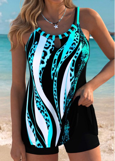
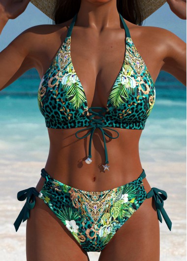
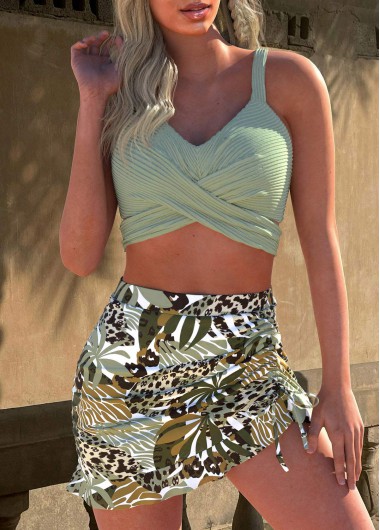
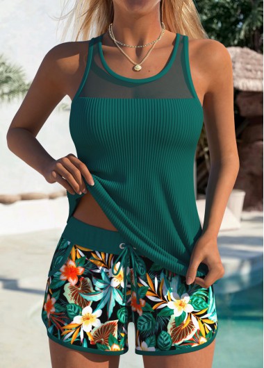
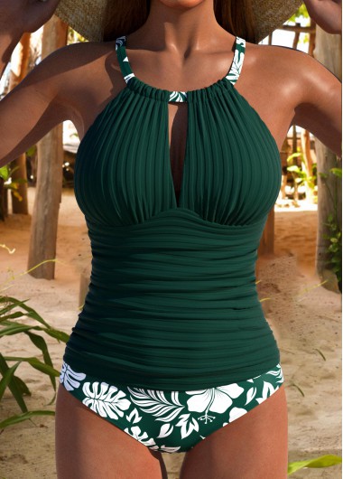
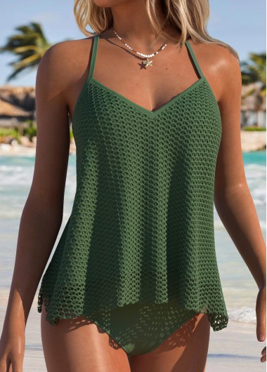
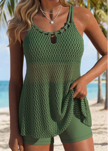
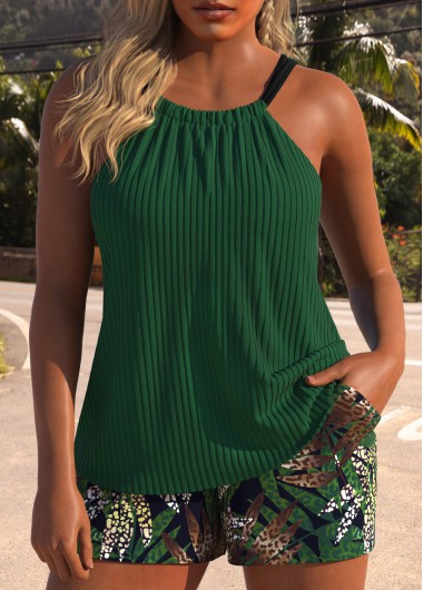
Tummy Coverage Leopard Green Tankini Set
MODLILY CLUB % Off MODLILY CLUB
% Off
MODLILY CLUB
% Off
 MODLILY CLUB
% Off
MODLILY CLUB
% Off
 MODLILY CLUB
% Off
MODLILY CLUB
% Off
 MODLILY CLUB
% Off
MODLILY CLUB
% Off
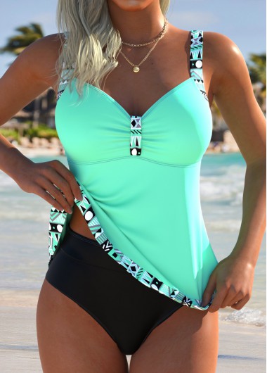
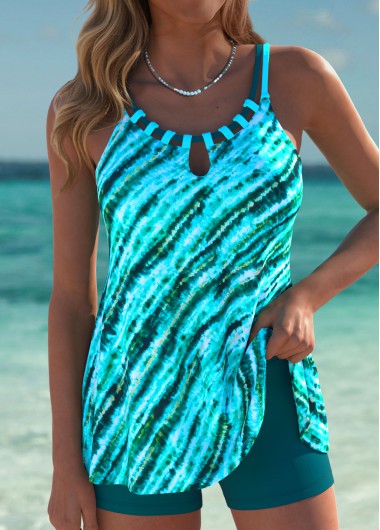
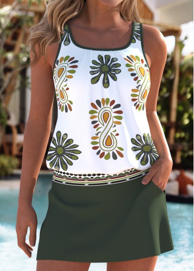
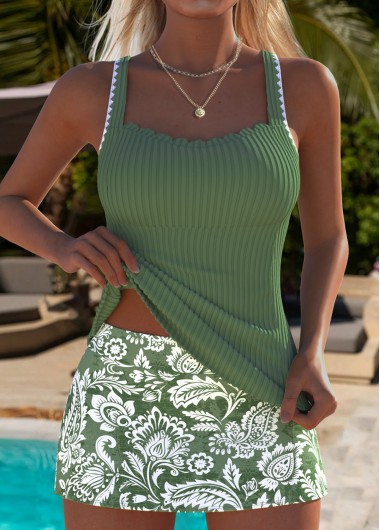
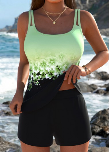
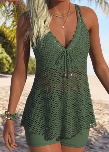
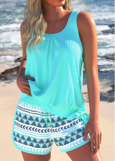
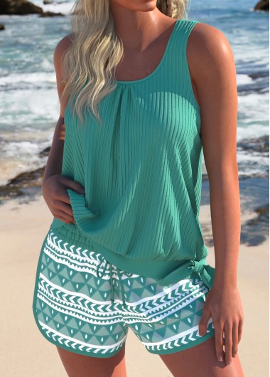
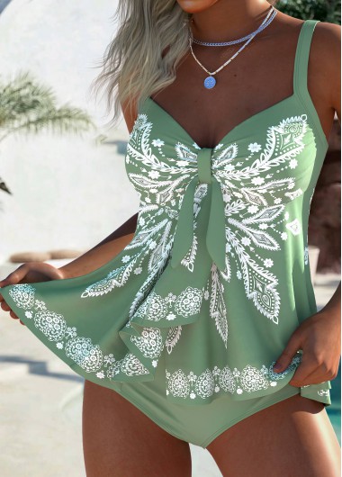
Mint Green Mid Waisted Tribal Print Tankini Set
MODLILY CLUB % Off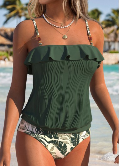 MODLILY CLUB
% Off
MODLILY CLUB
% Off
 MODLILY CLUB
% Off
MODLILY CLUB
% Off
 MODLILY CLUB
% Off
MODLILY CLUB
% Off
 MODLILY CLUB
% Off
MODLILY CLUB
% Off
 MODLILY CLUB
% Off
MODLILY CLUB
% Off
 MODLILY CLUB
% Off
MODLILY CLUB
% Off
 MODLILY CLUB
% Off
MODLILY CLUB
% Off
 MODLILY CLUB
% Off
MODLILY CLUB
% Off
 MODLILY CLUB
% Off
MODLILY CLUB
% Off
 MODLILY CLUB
% Off
MODLILY CLUB
% Off
 MODLILY CLUB
% Off
MODLILY CLUB
% Off
 MODLILY CLUB
% Off
MODLILY CLUB
% Off
 MODLILY CLUB
% Off
MODLILY CLUB
% Off
 MODLILY CLUB
% Off
MODLILY CLUB
% Off
 MODLILY CLUB
% Off
MODLILY CLUB
% Off
 MODLILY CLUB
% Off
MODLILY CLUB
% Off
 MODLILY CLUB
% Off
MODLILY CLUB
% Off
 MODLILY CLUB
% Off
MODLILY CLUB
% Off
 MODLILY CLUB
% Off
MODLILY CLUB
% Off
 MODLILY CLUB
% Off
MODLILY CLUB
% Off
 MODLILY CLUB
% Off
MODLILY CLUB
% Off
 MODLILY CLUB
% Off
MODLILY CLUB
% Off
 MODLILY CLUB
% Off
MODLILY CLUB
% Off
 MODLILY CLUB
% Off
MODLILY CLUB
% Off
 MODLILY CLUB
% Off
MODLILY CLUB
% Off
 MODLILY CLUB
% Off
MODLILY CLUB
% Off
 MODLILY CLUB
% Off
MODLILY CLUB
% Off
 MODLILY CLUB
% Off
MODLILY CLUB
% Off
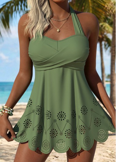
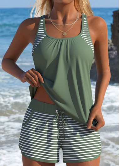
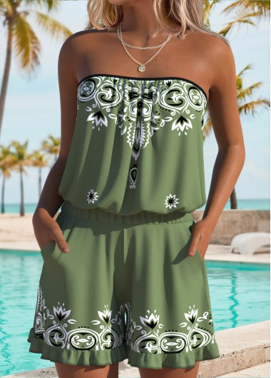
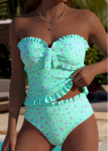
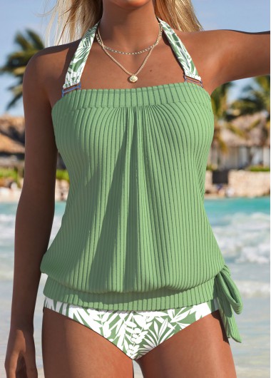
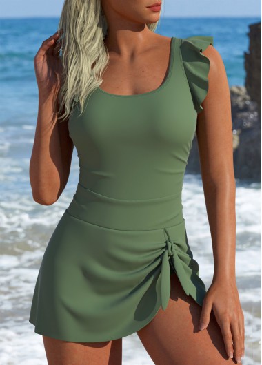
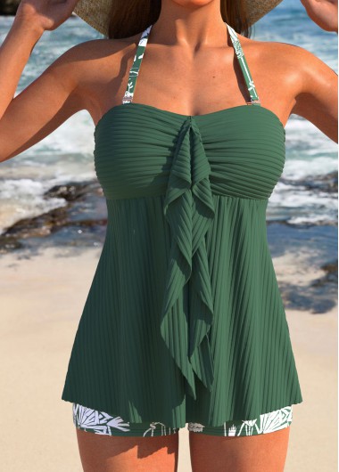
Sage Green Color Bandeau Tankini Set
MODLILY CLUB % Off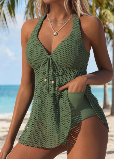 MODLILY CLUB
% Off
MODLILY CLUB
% Off
 MODLILY CLUB
% Off
MODLILY CLUB
% Off
 MODLILY CLUB
% Off
MODLILY CLUB
% Off
 MODLILY CLUB
% Off
MODLILY CLUB
% Off
 MODLILY CLUB
% Off
MODLILY CLUB
% Off
 MODLILY CLUB
% Off
MODLILY CLUB
% Off
 MODLILY CLUB
% Off
MODLILY CLUB
% Off
 MODLILY CLUB
% Off
MODLILY CLUB
% Off
 MODLILY CLUB
% Off
MODLILY CLUB
% Off
 MODLILY CLUB
% Off
MODLILY CLUB
% Off
 MODLILY CLUB
% Off
MODLILY CLUB
% Off
 MODLILY CLUB
% Off
MODLILY CLUB
% Off
 MODLILY CLUB
% Off
MODLILY CLUB
% Off
 MODLILY CLUB
% Off
MODLILY CLUB
% Off
 MODLILY CLUB
% Off
MODLILY CLUB
% Off
 MODLILY CLUB
% Off
MODLILY CLUB
% Off
 MODLILY CLUB
% Off
MODLILY CLUB
% Off
 MODLILY CLUB
% Off
MODLILY CLUB
% Off
 MODLILY CLUB
% Off
MODLILY CLUB
% Off
 MODLILY CLUB
% Off
MODLILY CLUB
% Off
 MODLILY CLUB
% Off
MODLILY CLUB
% Off
 MODLILY CLUB
% Off
MODLILY CLUB
% Off
 MODLILY CLUB
% Off
MODLILY CLUB
% Off
 MODLILY CLUB
% Off
MODLILY CLUB
% Off
 MODLILY CLUB
% Off
MODLILY CLUB
% Off
 MODLILY CLUB
% Off
MODLILY CLUB
% Off
 MODLILY CLUB
% Off
MODLILY CLUB
% Off
 MODLILY CLUB
% Off
MODLILY CLUB
% Off
 MODLILY CLUB
% Off
MODLILY CLUB
% Off
 MODLILY CLUB
% Off
MODLILY CLUB
% Off
 MODLILY CLUB
% Off
MODLILY CLUB
% Off
 MODLILY CLUB
% Off
MODLILY CLUB
% Off
 MODLILY CLUB
% Off
MODLILY CLUB
% Off
 MODLILY CLUB
% Off
MODLILY CLUB
% Off
 MODLILY CLUB
% Off
MODLILY CLUB
% Off
 MODLILY CLUB
% Off
MODLILY CLUB
% Off
 MODLILY CLUB
% Off
MODLILY CLUB
% Off
 MODLILY CLUB
% Off
MODLILY CLUB
% Off
 MODLILY CLUB
% Off
MODLILY CLUB
% Off
 MODLILY CLUB
% Off
MODLILY CLUB
% Off
 MODLILY CLUB
% Off
MODLILY CLUB
% Off
 MODLILY CLUB
% Off
MODLILY CLUB
% Off
 MODLILY CLUB
% Off
MODLILY CLUB
% Off
 MODLILY CLUB
% Off
MODLILY CLUB
% Off
 MODLILY CLUB
% Off
MODLILY CLUB
% Off
 MODLILY CLUB
% Off
MODLILY CLUB
% Off
 MODLILY CLUB
% Off
MODLILY CLUB
% Off
 MODLILY CLUB
% Off
MODLILY CLUB
% Off
 MODLILY CLUB
% Off
MODLILY CLUB
% Off
 MODLILY CLUB
% Off
MODLILY CLUB
% Off
 MODLILY CLUB
% Off
MODLILY CLUB
% Off
 MODLILY CLUB
% Off
MODLILY CLUB
% Off

These are the two directions green goes in swimwear, and choosing between them settles most of the decision.
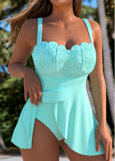
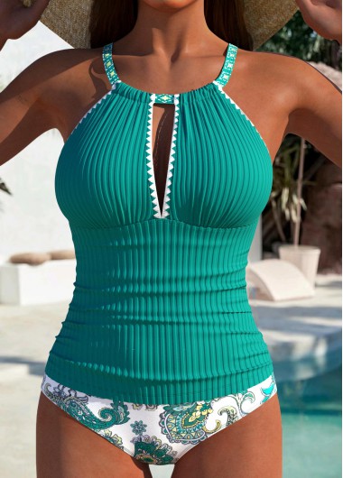
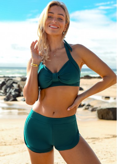
Emerald and jade are jewel tones — clear, saturated, blue-leaning. They read as deliberate and slightly formal, they photograph vividly against water, and they have the same effect as sapphire or ruby: the color is the point.
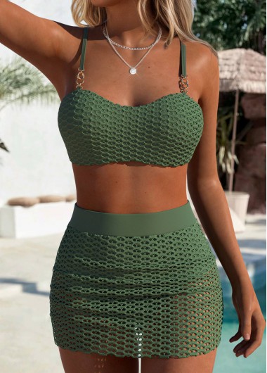
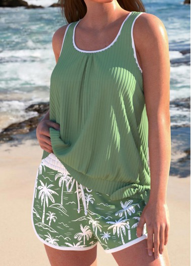
Olive, sage and khaki are muted and yellow-leaning. They function as neutrals rather than colors, pairing with almost any cover-up and receding rather than announcing themselves. If you want green without it being the subject, this is the end to look at.
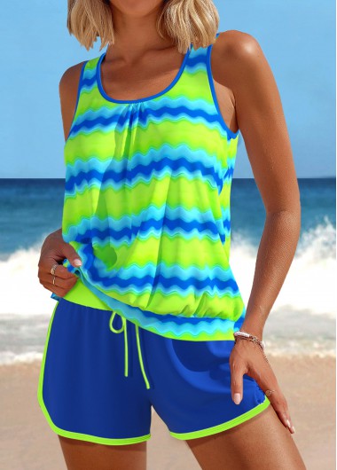
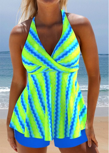
There is a third group worth mentioning: bright lime and neon greens, which behave like the brights in any palette — high impact, short season, and demanding of everything worn near them.
Green is unusual in that both ends of the range flatter, but they flatter different people, and the wrist test settles it.
Check your inner wrist in daylight. Veins reading blue or purple point to cool undertones, which pair with the blue-leaning greens — emerald, jade, teal-green. Veins reading green point to warm undertones, better served by olive, sage and moss. Anyone who cannot tell is likely neutral and can wear either.
Green also has a specific advantage: because it sits opposite red on the color wheel, it tends to neutralise redness in skin rather than emphasising it. That makes it a good choice for anyone who finds warm colors draw out flush, and it is why olive in particular photographs kindly.
Depth matters more than shade here, and the rule is straightforward.
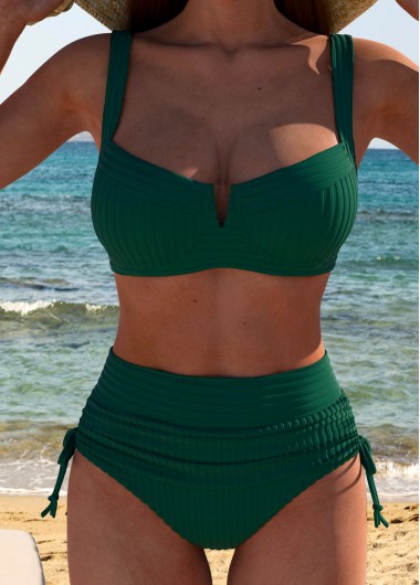
Darker greens — forest, deep olive, bottle — behave like black in how they handle contour. They absorb light rather than reflecting it, which means they show less shape and pair naturally with construction-based smoothing. Our tummy control range works particularly well in these tones, since the shadows created by ruching read as texture rather than as contour.
Lighter and brighter greens reflect more, so a fully lined body matters more — worth confirming in the description, since a single-layer sage suit shows considerably more than a single-layer forest one. For a defined shape instead of a smoothed one, underwire reads cleanly at any depth of green.
One practical note on green specifically: it is the color most likely to look different in person than on screen, because monitors render mid-greens inconsistently. If you are ordering a specific shade rather than any green, expect some variance — and if it matters, order two shades and return one rather than guessing.
Two things happen to green that do not happen to most other shades, and neither shows in a photograph.
In water it disappears. Green sits close to the color of the water itself, so it blends rather than stands out — our orange page covers the visibility question properly, since that color sits at the far end of the same scale. Beside a pool it makes no difference; in open water it can.
In sunlight it shifts rather than pales. Green is a mixed color rather than a primary, so when it ages, whichever component gives out first takes the shade with it — an olive drifts yellow, a teal drifts blue. That is why an old green suit reads as the wrong color instead of a worn one, and why drying it out of direct sun matters more here than almost anywhere else.
The two ends of this range make opposite demands of whatever is worn near them.
Olive behaves as a neutral: it sits happily against white, cream, tan, denim and black, so most cover-ups you already own will do. Emerald behaves as a statement and wants plain company — black or white, nothing patterned, no second jewel tone anywhere near it.
The same split decides the layer. A cream or tan kaftan over olive reads coherent; the identical layer over emerald reads like a decision. Compare cuts across the one piece and tankini ranges — construction does not change with the shade.

Create Account
Create password to get more coupons!
$100 OFF
New Members only!
Create Account
Create password to get more coupons!
$100 OFF
New Members only!
$20 OFF
for text subscribe

*It includes 4 coupons
Expired:
CODE:
Expired:
Fast Self-Service for Facebook Users.
24/7 online service available to all customers.
To avoid waiting time online, you could submit a ticket to us, our agent will respond within 1 business day.