



Fast Self-Service for Facebook Users.
24/7 online service available to all customers.
To avoid waiting time online, you could submit a ticket to us, our agent will respond within 1 business day.


Fast Self-Service for Facebook Users.
24/7 online service available to all customers.
To avoid waiting time online, you could submit a ticket to us, our agent will respond within 1 business day.
Sign In / Register
My Balance
Modlily Club
Sign in for the best experience
Processing
Please enter a valid number
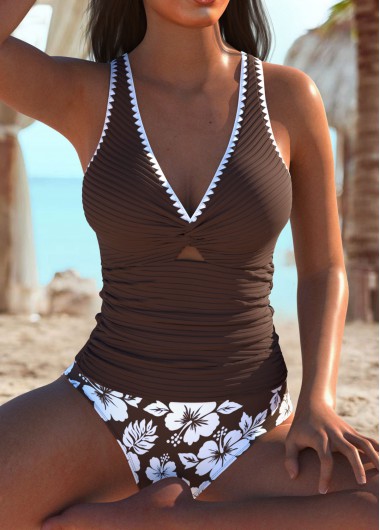

I absolutely LOVE this suit. I think it is my favorite. It is very flattering and comfortable to wear.
 MODLILY CLUB
% Off
MODLILY CLUB
% Off
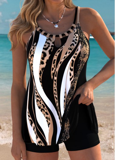
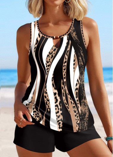
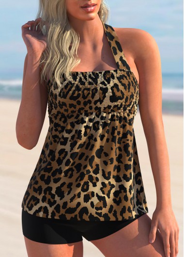
Tummy Coverage Leopard Dark Coffee Tankini Set
MODLILY CLUB % Off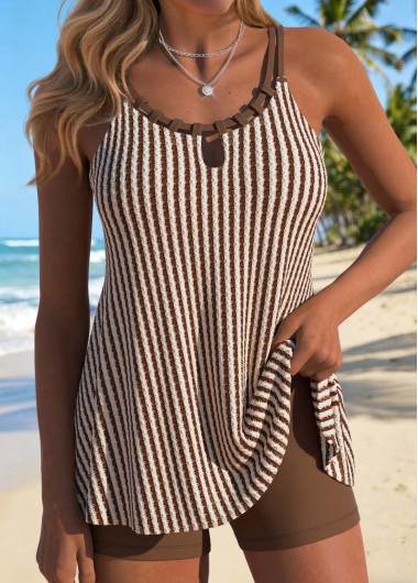
Love the color and fit
MODLILY CLUB
% Off
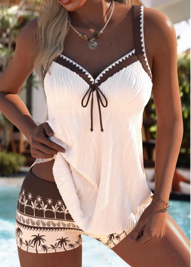
Fabulous products great quality
MODLILY CLUB
% Off
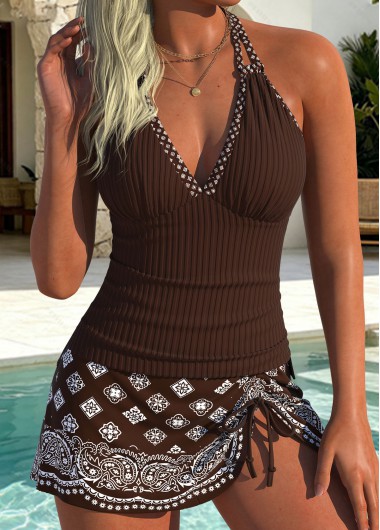
Love the color and fit
MODLILY CLUB
% Off
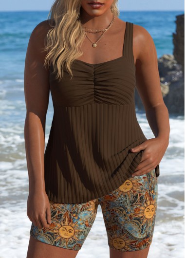 MODLILY CLUB
% Off
MODLILY CLUB
% Off
 MODLILY CLUB
% Off
MODLILY CLUB
% Off
 MODLILY CLUB
% Off
MODLILY CLUB
% Off
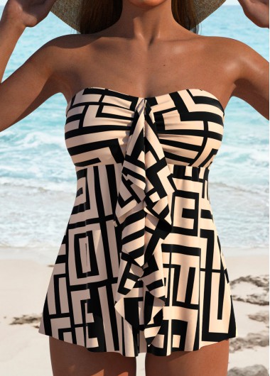
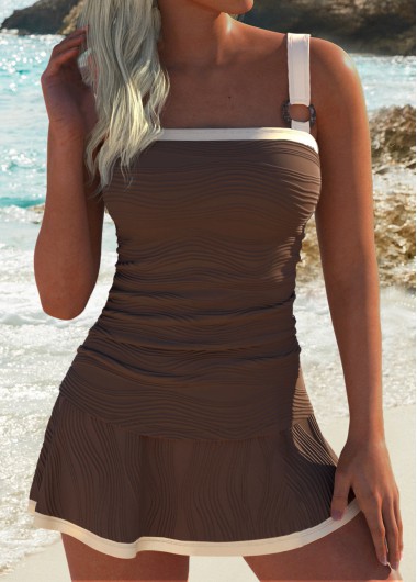
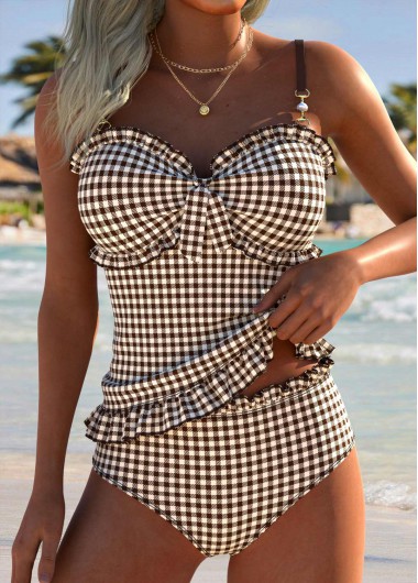
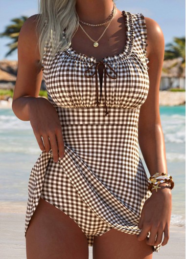
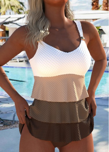
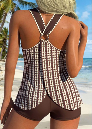
Ruffle Geometric Print Light Coffee Tankini Set
MODLILY CLUB % Off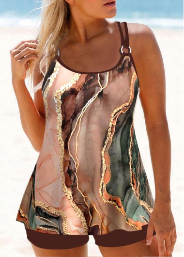 MODLILY CLUB
% Off
MODLILY CLUB
% Off
 MODLILY CLUB
% Off
MODLILY CLUB
% Off
 MODLILY CLUB
% Off
MODLILY CLUB
% Off
 MODLILY CLUB
% Off
MODLILY CLUB
% Off
 MODLILY CLUB
% Off
MODLILY CLUB
% Off
 MODLILY CLUB
% Off
MODLILY CLUB
% Off
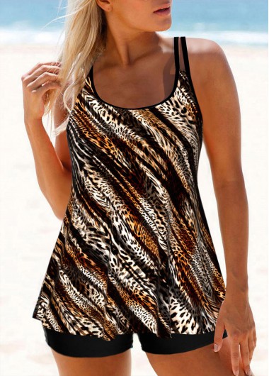
Leopard Dark Coffee Double Straps Tankini Set
MODLILY CLUB % Off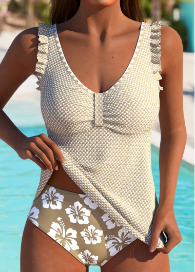 MODLILY CLUB
% Off
MODLILY CLUB
% Off
 MODLILY CLUB
% Off
MODLILY CLUB
% Off
 MODLILY CLUB
% Off
MODLILY CLUB
% Off
 MODLILY CLUB
% Off
MODLILY CLUB
% Off

Brown covers a wider range than almost any other color word in swimwear, and the two ends do opposite jobs. A deep chocolate behaves like a dark neutral: it anchors, it recedes, and it partners almost anything above it. A light caramel or tan behaves like a color: it sits forward, it catches sun, and it needs thinking about against skin tone.
The middle of the range — a mid brown with warmth in it — is the hardest to place, because it is close enough to several skin tones to read as an absence rather than as a choice. It is the shade to see in person if you can, and the one worth ordering with a contrast trim if you cannot.
A dark brown does most of what a black bottom does and does it more softly. It anchors a print, it partners a bright top, and it does not create the hard line at the waist that black sometimes does against pale skin.
It also sits better with warm colors than black does. Rust, olive, mustard and warm prints all look considered over brown and slightly stark over black, which is the argument for owning one of each rather than two blacks.
Where black still wins is versatility with cool colors and with anything monochrome. Brown with gray or with a cool pink rarely settles.
The pale end needs the same care any near-skin shade needs. A caramel that sits close to your own tone reads at a glance as less coverage than there actually is, particularly in photographs and particularly from a distance.
Two things prevent it entirely. Contrast at the edges — a darker binding, a trim, or a print border — gives the eye a boundary to find. And separation between the halves: a light brown top over a dark bottom is never ambiguous, where light brown on both halves can be.
Lining matters here for the same reason it matters in white. A pale brown is a light color regardless of how warm it looks on screen.
This is where brown earns its place fastest. Most swim prints contain a warm element somewhere — a tan, a rust, a sand — and a brown bottom picks that out and makes the print look like it was designed with it. Black under the same print flattens the warmth instead.
Animal prints in particular sit better on brown than on anything else, since the print is already brown. Florals with warm centers do the same. The exception is a print built on cool blues and grays, where brown stops looking like part of the outfit and starts looking like a separate garment.
The habit worth forming: hold the print against the bottom rather than guessing from the product photograph. A matched set has already done that work, and a plain brown short will partner more prints than most people expect.
Brown is the neutral to buy second rather than first, and there is no argument for owning it before you own a dark anchor. Most drawers start with a black bottom because it partners everything; brown earns its place once there is enough warmth in the rest of the collection for it to have something to do.
Once it is there it tends to get worn more than expected, particularly in the second half of a holiday when a tan changes what suits you. It also photographs more kindly than black in strong midday sun, which flattens a black top into a silhouette.

Create Account
Create password to get more coupons!
$100 OFF
New Members only!
Create Account
Create password to get more coupons!
$100 OFF
New Members only!
$20 OFF
for text subscribe

*It includes 4 coupons
Expired:
CODE:
Expired:
Fast Self-Service for Facebook Users.
24/7 online service available to all customers.
To avoid waiting time online, you could submit a ticket to us, our agent will respond within 1 business day.