



Fast Self-Service for Facebook Users.
24/7 online service available to all customers.
To avoid waiting time online, you could submit a ticket to us, our agent will respond within 1 business day.


Fast Self-Service for Facebook Users.
24/7 online service available to all customers.
To avoid waiting time online, you could submit a ticket to us, our agent will respond within 1 business day.
Sign In / Register
My Balance
Modlily Club
Sign in for the best experience
Processing
Please enter a valid number


 MODLILY CLUB
% Off
MODLILY CLUB
% Off
 MODLILY CLUB
% Off
MODLILY CLUB
% Off

Red carries more meaning than any other swimwear color, and that is much of its appeal. It reads as confidence and warmth, the color of celebration in many cultures and of summer holidays in plenty of memories. Worn on the bottom half alone, it keeps that energy while feeling more relaxed than a head-to-toe red suit.
The famous red swimsuits of film and television were mostly one-pieces, yet the association has passed to two-pieces as well: a sense of being entirely at ease on the beach. A red bottom borrows it quietly, especially under a neutral top, where the color speaks without the whole outfit raising its voice.
Red also reads well from a distance. On a crowded beach or a busy pool deck it is among the easiest colors to spot, a small practical bonus for anyone meeting friends at the water. Among towels and umbrellas it stays a cheerful accent even when the rest of the beach bag is neutral.
Proportion is where the meaning shows most. A red bottom with a matching top makes a statement; with black, white or navy above, the red becomes a highlight. Red bikinis show the matched version for anyone who wants the full effect.
The shade matters more than the word red. Bright red is clear and saturated, leaning neither strongly orange nor blue; it suits the widest range of skin tones and looks the most classic of the three. It is also the shade most likely to match a red already running through a printed top.
Deep reds, from dark red to burgundy, lean toward blue. They look richer and quieter, hide water marks well and sit beautifully against fair skin and in evening light. A dark red bottom is the easiest way into the color for anyone who finds bright red too loud.
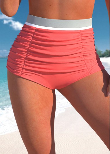
Coral and light reds lean toward orange. They glow against a tan, look fresh in strong midday sun and pair naturally with white and sand tones. Sitting between red and pink, they read softer and more playful than a true red. Coral is also kind to anyone who finds true red harsh close to the skin.
To judge the shade on a listing, look at more than one photograph. Studio lighting can push a red toward orange or toward pink, and the fabric close-up is usually the truest. A product name that says coral, burgundy or wine tells you more than the thumbnail, and which red flatters most depends on skin tone more than on any rule.
A neutral top keeps attention on the red and makes the bottom the part of the outfit that stands out. Black gives the sharpest contrast, white the freshest and navy a nautical look that feels classic without effort. Sand and cream tops soften a bright red for anyone who prefers a gentler pairing.
Cut decides how much red there is. A full coverage bottom puts a large block of color on the lower half; a cheeky or tie-side cut keeps it small and graphic; a high rise adds a vintage feel, especially beneath a black halter. High waisted bikini bottoms and full coverage bottoms show those two ends.
A printed top can join in as long as it contains the same red. A gingham or striped top with a red thread ties the halves together, and red gingham bikinis are an easy example of the idea. Keep the other colors in the print quiet so the red still leads.
Saturated dyes dull fastest in strong sun and chlorine, so a quick rinse in cool fresh water and drying in the shade keep red looking like red through a season. For the simplest partner of all, black bikinis offer a top that works with any shade above.

Create Account
Create password to get more coupons!
$100 OFF
New Members only!
Create Account
Create password to get more coupons!
$100 OFF
New Members only!
$20 OFF
for text subscribe

*It includes 4 coupons
Expired:
CODE:
Expired:
Fast Self-Service for Facebook Users.
24/7 online service available to all customers.
To avoid waiting time online, you could submit a ticket to us, our agent will respond within 1 business day.