



Fast Self-Service for Facebook Users.
24/7 online service available to all customers.
To avoid waiting time online, you could submit a ticket to us, our agent will respond within 1 business day.


Fast Self-Service for Facebook Users.
24/7 online service available to all customers.
To avoid waiting time online, you could submit a ticket to us, our agent will respond within 1 business day.
Sign In / Register
My Balance
Modlily Club
Sign in for the best experience
Processing
Please enter a valid number

Brought for 28 yr old Granddaughter
 MODLILY CLUB
% Off
MODLILY CLUB
% Off
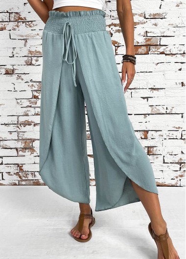
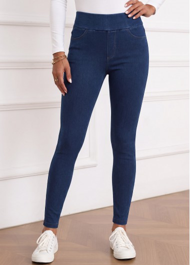
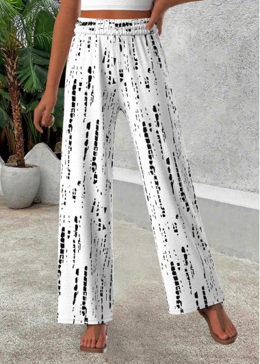
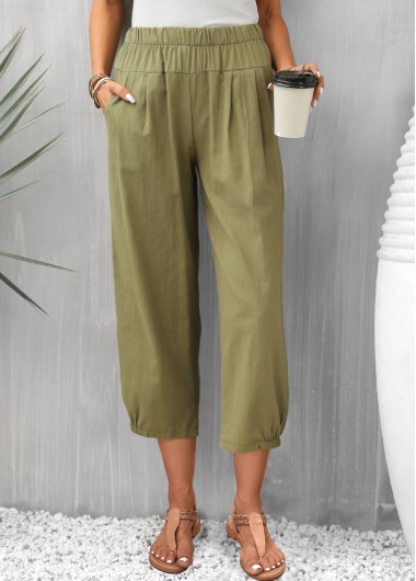
These pants are just like pictured. They’re so cute and they are going to be perfect for my vacation. And again loose fitting clothes like these with personality really adds to a person who is looking for clothes to wear who has fibromyalgia clothes hurt so this is perfect.
MODLILY CLUB
% Off
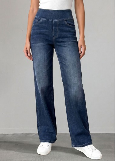
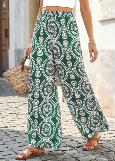
I ♥️ these pants. I'm petite, so the length hit me just above the ankle. Soft, roomy & comfy. Reordered in other colors!
MODLILY CLUB
% Off
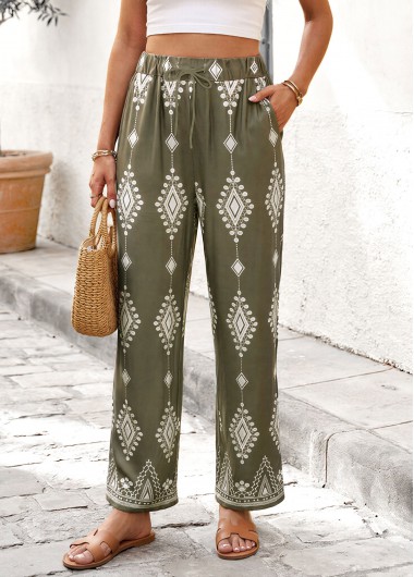
Delivered on time. But was large fit on me.
MODLILY CLUB
% Off
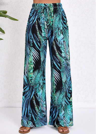
These pants are so nice. Feel good on, nice and light weight. Look like picture. True to size.
MODLILY CLUB
% Off
 MODLILY CLUB
% Off
MODLILY CLUB
% Off
 MODLILY CLUB
% Off
MODLILY CLUB
% Off
 MODLILY CLUB
% Off
MODLILY CLUB
% Off
 MODLILY CLUB
% Off
MODLILY CLUB
% Off
 MODLILY CLUB
% Off
MODLILY CLUB
% Off
 MODLILY CLUB
% Off
MODLILY CLUB
% Off
 MODLILY CLUB
% Off
MODLILY CLUB
% Off

Begin by deciding how much attention you want the green to receive. A quiet cream or white top lets the lower color become the focal point, while a navy shirt can create a darker, more contained combination. A blue top may introduce a cooler relationship, depending on its shade. Put the actual garments together rather than relying on the broad color names, since green covers many different appearances.
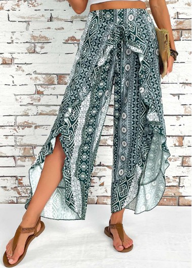
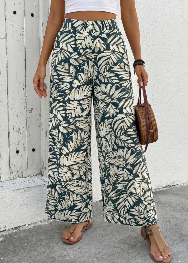
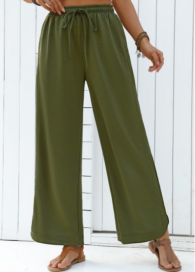
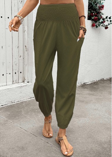
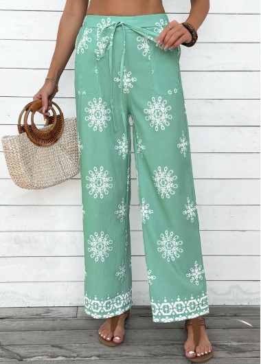
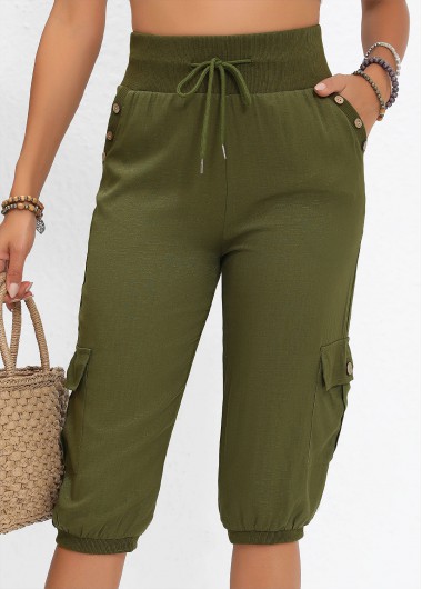
For women's pants, green can act as either a statement color or a near-neutral. A muted olive behaves differently from a brighter turquoise-looking shade, so consider the saturation before adding another vivid piece. Olive green pants focus on the more restrained family, while blue pants provide another reference for cooler color relationships. A print can also connect the pieces when it contains a small amount of the green you chose.
Use one clear idea to organize the outfit. That might be a light top above a dark green base, or a repeated color between your shirt and a detail in the pants. You do not need a strict matching set. Try the combination with the shoes and bag you plan to use, then check whether the accent still feels balanced. The most useful pairing is one that works with your own clothes and the occasion, rather than one chosen from an abstract list of permitted colors.
Lighter and deeper greens can produce different levels of contrast beside the same top. A pale shirt above a dark leg creates a clearer boundary than two similar light tones. That difference can be used deliberately when you want the waist arrangement to remain visible. A softer combination may be preferable when you want the outfit to feel quieter. Compare the garments in natural light to see which effect you enjoy.
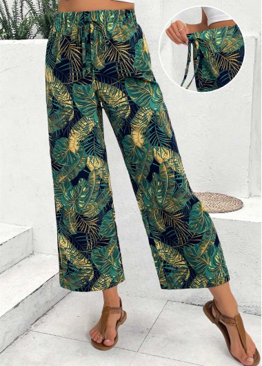
Print adds another decision. A small repeating design can read differently from a broad floral or geometric pattern, even if both have a green base. Look at how much plain background remains visible and which supporting colors appear in the design. Polka dot pants and printed pants provide pattern-focused references when that detail becomes your main interest.
Color labels do not establish one universal shade. Mint, dark green and emerald are useful search descriptions, but the listing and photographs need to be checked for the individual item. Screen settings can affect how a color looks, so avoid building an entire outfit around an expected exact match before seeing the garment. Green trouser pants for women can still fit a practical wardrobe when their shade is not identical to an existing top. Texture, a neutral layer and a small connecting accessory offer other ways to make the combination feel intentional.
When several greens appear in one print, let the background shade guide your first outfit and a smaller accent guide the next. That gives the same garment two distinct combinations without asking a top to reproduce every color. A solid cream shirt can calm a lively design, while a dark upper layer may emphasize its paler details. Compare the result with your preferred level of contrast.
A top can either support the green or introduce the outfit's main pattern. If the pants already carry a print, a simpler upper piece leaves that design easier to see. Pick a color from the pattern for a gentle connection, or use a quiet neutral when you want a clearer separation. With a plain green pair, a patterned shirt can become the focus without adding another busy surface below.
Think about the amount of each color as well as the shade. A large bright top creates a different balance from a small scarf in the same hue. An open jacket can reduce the visible area of a vivid shirt while adding a calmer outer layer. Black pants offer a darker alternative for another outfit, and cream pants explore a softer neutral base. Those comparisons can help you judge how much color you want in this particular combination.
The top's shape remains a separate styling question. Wide leg pants address broad-leg proportions, while straight leg pants cover a more contained line; use those pages when the silhouette is the main concern. Here, concentrate on the green relationship. Try the outfit standing and seated, with the upper layer open and closed. A color combination earns its place in your wardrobe when it feels comfortable and recognizably yours during the activities you actually have planned.

Create Account
Create password to get more coupons!
$100 OFF
New Members only!
Create Account
Create password to get more coupons!
$100 OFF
New Members only!
$20 OFF
for text subscribe

*It includes 4 coupons
Expired:
CODE:
Expired:
Fast Self-Service for Facebook Users.
24/7 online service available to all customers.
To avoid waiting time online, you could submit a ticket to us, our agent will respond within 1 business day.